More Stuff From That Finally-Finished Journal

Here's a couple more pages from that journal I talked about a couple of days ago (the one I did the groovy cover for).

This page features another of my favourite quotes, "Imagination Is More Important Than Knowledge" from Einstein.  Blingy flower practice pieces from Joanne Sharpe's "Bling It On" class juxtapose with the zetti-style character on the right.  The background is very textural.  I used old dressmaking patterns over the page and then grunge painted it.


The next page was fun too because I finally used up this funny little character that I had made eons ago.  She's made up of two zetti-style rubber stamps and vintage butterfly wings.  She finally had the right backdrop which was created using recycled doodads, dressmaker's pattern tissue (dye sprayed) and some recycled office supplies.  Love the quote too.  It is SO true!


This next image is another hybrid, using a background with spray dyed tissue over neon poster paints (I really will work with almost anything, you know!).  The little doll-like character is a color copy of the central image from one of my collages from many years ago now scaled down to about one quarter its original size.  The hearts are practice pieces created in Joanne Sharpe's "Bling It On" class.  Although they don't show up well in the scan, they are metallic.


And one more for now, this is the most recent page finished.  I completely forgot I had this outrageously funky zetti-style stamp in my collection until recently.  She is featured on a grungy painted background (acrylics and poster paints) and the flowers are higlighted in Twinking H20s for some fun shimmer to offset the grungy background.  I will probably work some more on the lettering.  I think the white letters need to be outlined in black.  But again, I am trying to show restraint at times in my work and not over-do things to the point where I no longer like it. 


So What's In That Just-Finished Art Journal??

A question, I have been asked a few times so I thought I would post some of the little doodlings and practice pieces from the journal referred to in my post from the other day.

I won't bore you with all of the pages, and some of them are already in this blog in older posts, but I know there's a few that haven't been shared, so here goes.

This one features one of my favourite quotes, "Nothing Is Worth More Than This Day," from Goethe.  It is a hybrid piece using the background I created when taking Joanne Sharpe's "Color Love 101" class and a little practice birdie I made for Juliette Craine's "Whimsical Animals" class. 

I love how this simple little piece came out.  It just goes to show that every background will one day find its match in a central image.

Journal Cover from "Bling It On"

Oh, I am so bad for not having posted more in the last couple of months!  Work is VERY busy always and leaves little time for art.  Sigh!  What I would do to retire now and do nothing but have fun in my studio.  Where is that lottery winning when you need it?

Anyway, in our "Bling It On" class with Joanne Sharpe recently, we were sparklifying everything we could lay our hands on with all kinds of different supplies.  One of the things I created was with an old CD (you know me and my recycling).  I covered it in metallic gold fabric paint, along with Twinking H20s and Silks (love both those products).  I then layered on top of it another experiment in blinginess from this same class.  I took a recycled report cover (transparent) and did a floral outline in black dimensional paint and when that was dry, painted on the reverse with purple and red Silks.  I cut it out, glued it to the decorated CD and then finished it off with a hand made face cabochon that I've had lying around for years and years.

I have to say that the total effect is really cool.  It's highly textural and unfortunately the scan does not do it justice.  It is very shiny.  The only thing now ... what the heck am I going to do with it??

Well a couple of months later, after it sitting on my studio desk taking up valuable space, I was finishing up one of my art journals and I was thinking that I needed to do something with the cover and, voila!  A home for this mixed media piece.  This is one of those awesome Strathmore journals with the brown, faux leather look cover and it was just too plain.  I mean really, what self respecting mixed media artist can leave ANYTHING plain??  So now it is embellished with gold metallic acrylics and silver and red Silks and is the perfect backdrop to the CD piece. 

I can't decide if it's done or not.  Sometimes I really need to learn to leave well enough alone.  Only time will tell how many doodads and embellishments will make it onto this journal.

Fun With Whimsical Animals

So, my latest online course is with the awesome Juliette Crane, learning how to create whimsical animals.  It only started this past weekend so I don't have a whole lot done yet, but I thought I would post a couple of images.

The backgrounds of these two scans are pages I created as practice in Joanne Sharpe's Color Love 101 online class, but which I'd never developed any further.  How fun was it to practice making cutesy little animals and have a ready made background to put them onto!!  As a person with very limited time to dedicate to art, I was thrilled to have those backgrounds already done.  The little bunnies just come to life on them, don't you think?

The first one is "Go Ask Alice, I Think She'll Know" (lyrics from the song "White Rabbit" by Jefferson Airplane).


The second one is "Welcome To My Garden."

BONUS LESSON #36 - COLOR LOVE 101 - RECYCLE YOUR ART

COLOR LOVE BONUS LESSON #36 – “RECYCLE YOUR ART”

Hello and welcome to my lesson!  I hope you’ll enjoy the tips and tricks I share here and find a way to maximize the use of all the practice pieces and bits of art and doodads you create but never quite know what to do with.  

I have been using these tricks for about 15 years in my art so it’s very much second nature to me.  Some of you will know me from Ebay and Etsy (JoannaBanana) where my original art in collage and mixed media has a focus on using recycled materials and keeping them out of our landfills.  It’s very rewarding personally to be able to use something that was headed for the trash, no matter how small, and know that it has become a part of a piece of art that someone else will treasure. 

With the huge strides technology has made in recent years, it only made sense to try to stretch the use of my art beyond the original piece.  I scanned each and every one of my creations at high resolution before putting them up for sale.  As the originating artist, I retain the copy rights even if the original is owned by someone else.  I knew I could re-use those images in many ways and thus extend the life of my art into new original art.  I also realized that practice pieces and those other bits that weren’t quite good enough to be considered finished art, were still very valuable to me.

I am blabbing on a bit about this because I want you to start looking at your art and practice pieces in a different light.  There is so much potential in those little pieces, even the ones you don’t really like.  At the risk of creating a whole whack of hoarders, I’ll say this:  don’t throw anything out.  Within reason, of course.  There is so much you can do with those little bits and pieces and I know you’ll be pleased with the results.

Enough babbling.  Let’s get started.

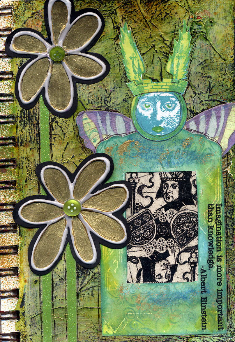
In this lesson I am showing you images from two different mini art journals I created recently, with this lesson in mind.  I am not going to review the creation of the mini journal itself, since we all took that lesson with Joanne here in Color Love 101.  The only thing different about these two mini journals from what we were taught by Joanne, is that I used some acrylic paints for the pages that became the journals and I did not use any gesso over the paint because I wanted a bolder look.  Otherwise, the journals are just like the ones we have all created.  And remember, you can use these techniques for any project on any surface. 

Here are a couple of images of the two completed journals (both sides).


Now let’s take a look at some of the things I have recycled into these journals.  Below are photos of an original zentangle mandala (zendala) that I cut in half and used in the background of one of the journals.  There’s also an image of color copies from my original collage art from several years ago.  These scans were scaled way down to become magnets (business card sized at 2 X 3.5 inches).  They are the perfect size to become focal images on the mini journal pages.  Also shown is an original zentangle on a chipboard flower shape.  It was scanned, reduced in size, and printed on vibrant yellow and orange copy paper.  I probably got twenty shapes per sheet of 8.5 X 11” paper and you will see those little yellow and orange zentangled flowers throughout both mini journals.

 
 Are these ideas getting your brain going on what you could be doing with your art?  It’s just the beginning!  Let’s look at some more samples from the journals.

Here are some sample pages I created for Letter Love 101 and Color Love 101.  Nothing too exciting on their own, right?  However, if you tear them into strips or cut/punch them into interesting shapes, imagine how much they could add if used as borders or background images or even focal images for your journal pages.  Embellish them further with paint, markers, stickers, etc., and they become brand new original art.


You’ll see in some of these sample shots that I have used art tags for the focal images on some journal pages.  I must have created hundreds of altered art tags over the past dozen years or so.  Not all of them were used in other art and I had quite a few just sitting around collecting dust.  They are miniature pieces of art in their own right but how fun is it to incorporate them into pages in our mini journals?  If this doesn’t take your art journal to another level, I don’t know what will!  If you are like me, you have already invested hundreds of hours into creating little treasures like these art tags (or something similar) and it is SO very satisfying to finally find a home for them. 


The next several images show journal pages that incorporate those scaled down scans of my original collage art I mentioned earlier.  Although they were sized deliberately for me to make business card-sized magnets out of, they happen to work perfectly for mini journal pages.  They are color laser printed on glossy cardstock but ordinary copy paper would work just as well for this application (just be sure not to use an inkjet printer for this kind of application – the images will smear).  Again, think about how you could embellish these images further, creating brand new art.  Would you cut them apart?  Color or doodle on them to change the look?  Add a border with some funky paper?  Add glitter or other embellishments like rhinestones, stickers or washi tape?


I made about a bazillion little pieces when I was practicing my lettering for Letter Love 101.  The following scans show how I have used a few of them as accent pieces in the mini journals.  Remember, you don’t have to reinvent the wheel every time out.  You can get quick, highly satisfying results in your art by using things you’ve already made or have on hand.  For me, as a person with very limited time to dedicate to my art, being able to produce a finished piece in a short period of time is a must (and so satisfying).  Re-using things I’ve already made that don’t quite stand on their own as art, but that make great backgrounds or accents, makes sense. 


Below are the pages from the art journal where I cut apart an original zendala I made a couple of years ago.  I made sure to scan it at high resolution before I cut it apart.  That way I can always print it again, in any size, and reuse the image in other ways in the future.  Doesn’t it add a lot to the background of the pages?  There’s no denying that using these techniques truly creates one-of-a-kind pieces.


OTHER COLLAGE/MIXED MEDIA TECHNIQUES

Before I finish up this very long-winded lesson, I wanted to share some additional techniques that you may find useful, particularly if you haven’t done much art like this before.

  • If you take a look at the background of the mini art journals, you’ll see that one half of the pages are quite different from the other.  This was a deliberate choice I made when I first painted both sides of the bristol paper that would be cut, accordion folded and glued together to become the journals.  I deliberately flipped the two long pieces of bristol so that one half of one side would be in the green/yellow/brown tones and the other in the hot pink/orange/black tones.  This is a bit jarring to the eye (especially if you can imagine how it looked without all the embellishments on top of it and without gesso to tone it down).  I wanted it to be different, to have energy, and to jar the eye somewhat when you first looked at it.  However, in recognizing that that could be a bit much and appear somewhat discordant to the eye, I also made the deliberate decision to ensure that the components I used travelled across the full length of the journal when spread wide open.  Take a look at the images with this in mind.  You’ll see that the orange and yellow zentangle flowers are deliberately used across the whole journal.  You’ll also note that where there was a strong black presence in a number of the pages on the right hand half of the journal, I’ve added black accents on the left hand pages, drawing this strong color across to the middle.  This harmonizes the piece overall and diminishes a bit of the discordance.  The paper flowers are used across all pages too, to unify the journal as a whole, as are some of the recycled stickers and doodads I used.

  • A trick for successful collage art is to make sure you place some of your elements so they fall off the page or overlap the next page.  This means you’ll have to trim the excess that overhangs the edge of the page sometimes, but it gives your work a more natural look. 

  • Be bold when you choose elements for your pages.  Deliberately put together things that you think wouldn’t go well with one another.  You’ll be surprised how much interest this technique adds to your art. 

  • Play around with placement of your elements on your page before you glue them down, until you get an arrangement that is pleasing to the eye.  But don’t overthink it.  Trust in your own judgement.  Personally, I rarely plan my art.  I prefer to just let things happen as they may and I trust that I will just “know” when a piece is done. 

  • Think in terms of odd numbers when adding multiples of the same image or component to your page (3, 5, 7 etc.). 

  • Unless you are deliberately going for a minimalist look in your work, more is better, so don’t skimp on the elements or components you use.  Aim for a “full” page.  If you take a look at the large art journal page samples I have here on my blog (just scroll down right after the posting about the art swap), you’ll see what I mean by having “full” pages.  A full page invites the observer to come and stay awhile and discover new things in every area of the page.  (And just a side note about these large journal pages, they, too, use the techniques I’ve discussed here about re-using little bits and pieces you have already created).

  • We have a saying in my household, “If it’s relatively flat and not nailed down, it will end up in Joanna’s art.”  Funny, but true.  Look around at what will make interesting elements in your art.  Puzzle pieces.  Fibers and fabric scraps.  Vintage images.  Sheet music.  Dictionary pages.  Broken jewelry bits and findings.  Office supplies.  Postage stamps.  The list is absolutely endless!

I hope this lesson has piqued your curiosity and fired up your imagination.  If you need more inspiration, here are a few links to some of my work (current and past).


And if you want a bit more information about collage art and the how-to’s of it, here is a link to an online lesson I hosted many years ago on the EBSQ online art site:


And if you want even MORE inspiration and would like to know about fellow collage/mixed media artists I know throughout our online community, I invite you to email me at: joannabanana@shaw.ca or message me through FaceBook.  I'd be happy to share links to my favorites.

I encourage you to push the boundaries of your comfort zone with your art and to look around at what you can incorporate into your work.  You will not be disappointed.

Your Color Lovin’ Pal,
Joanna Grant

COLOR LOVIN' TREASURES ART SWAP PARTNER LIST

COLOR LOVIN’ TREASURES ART SWAP


PLEASE NOTE:  This list is being updated regularly because of the number of participants who indicated they were going to take part in the Art Swap but who are now backing out.  This means I may have to juggle some of you around a bit. Be sure to contact me directly if you have any question about who your partner is.

Here’s the list of participants partnered up.  Please send a message via the Color Love Facebook page to your partner as soon as you can and exchange mailing addresses.  Again, please be prompt about sending your piece of art to your partner.  If you run into delays in sending it, please let them know.

If you don’t see your name on this list and want to participate, please send me a message and I will do my best to partner you up with someone.

Thank you and have fun!

Joanna Grant


Gina Shillitani                                       Bhupali Gupte                                           Lynn Lucas
Jo Seymour                                          Ann Kristen Krier                                      Els Kovacs

Linda Rapchak                                      Siobhan Brignull                                      Carolyn Mac Intosh
Barbara Poe                                         Barb Browne                                            Amista Nielson

Lynna Satin Demay                               Jerri Matthews Thompson                        Dee Ryder
Linda Moore                                          Ann Miller                                                    Kathie Gadd

Erin Fish                                               Nickalli Bascochea-Braaten                   
Joan Waites                                         Timi Bronson                                            

Heidi Bound                                          Helen Huppertz                                       
Margarette Muster                                Diane Craft Mascolo                            

Tina Gray-Siebers                                Lori Bradford                                        
Laurie May                                           Sharon Denney Parcel                         

Beverly French Davis                           Joanne Sharpe                                       
Jill Cole-Adamy                                    Melanie Kuka                                       

Kari Jo Callison                                    Jean McNutty                                      
Teresa Kepler                                    Deb Thompson-Boring                            

LaNell Callon Taylor                              Robin Anderson
Joanna Grant                                          Sandy Sommerfeld

Susan Jensen                                       Isabelle Savignac 
Carolyn Coyle                                       Kimberly Ans

Leslie Lubell Williamson                       Sherry Pollack                                
Deborah Belica                                      Kelly Stone Reich              

Kathy Miller                                                     
Sheila Parker Bunney                          

Art Journal Update

I was asked to post some sample pictures of one of my art journals to this blog, so here we go.

This was a journal that I made from large scale scrapbook paper, bound together with embroidery floss.  I'd have to say in hindsight, that I should have used heavier weight paper but I wanted to use this stuff up and fortunately it has stood up to the task I gave it.  The journal ended up being about 9X12 and quite thick when I was done because I incorporated a lot of 3D elements into it.

I can't say that it is completely done.  Knowing me, I will continue to add bits and pieces here and there whenever the mood strikes.  I do like how it's turned out, combining my love for collage, doodling, recycling and all things mixed media.

Here are pages one and two.  The mahjonng pieces and watch face are real.  Lots of vintage images, stamped images, acetate and a variety of paint and finish techniques were used here.  They are actually a bit brighter than the scan shows.


Pages three and four have a real zetti feel to them.  I don't know what it is about zettiology, but I still love it so much.  It must be how funky and whimsical it is.  The mask is a 3D piece made from resin.


Pages five and six were at a state of doneness with the images in place when I took Joanne Sharpe's Letter Love 101 online course early in 2012.  This was one of the first practice pieces I did for lettering and I am pretty pleased with how it turned out (considering I had no idea what I was doing).  The lettering is reference to the wonderful old vintage poster images I used in the lower left and upper right of the two-page spread.  Back in the day when these images were created, everything was done with sheer artistic talent.  There was no digital art, no way to manipulate things with technology, just incredibly gifted artists creating such beautiful work.   I really appreciate that.


Thati's it for today.  I'll post more images from this journal as time allows.  I hope you enjoy them and that they inspire you.